The Ask:
Develop an experimental, expressive typographic design from an excerpt of “Invisible Cities” visualizing the chosen city. Create a typographic narrative with focus on expression by implementing various typographic approaches. Use graphic forms and image as supportive material. Implement the delivery format as an element of the creative process.
The Deliverable:
A fully visualized, and printed, typographic-led story based off of the City of Octavia.
The Process:
In order to begin this project, I needed to look into some experimentation with the elements that my story had contained and elaborated on.
My design approach was focused on setting the tone of a frail and fragile space, while also highlighting the fact that the city is held by the very thing that created my booklet’s typefaces – string. In this project I created two custom experimental typefaces.
The Process, CONT.:
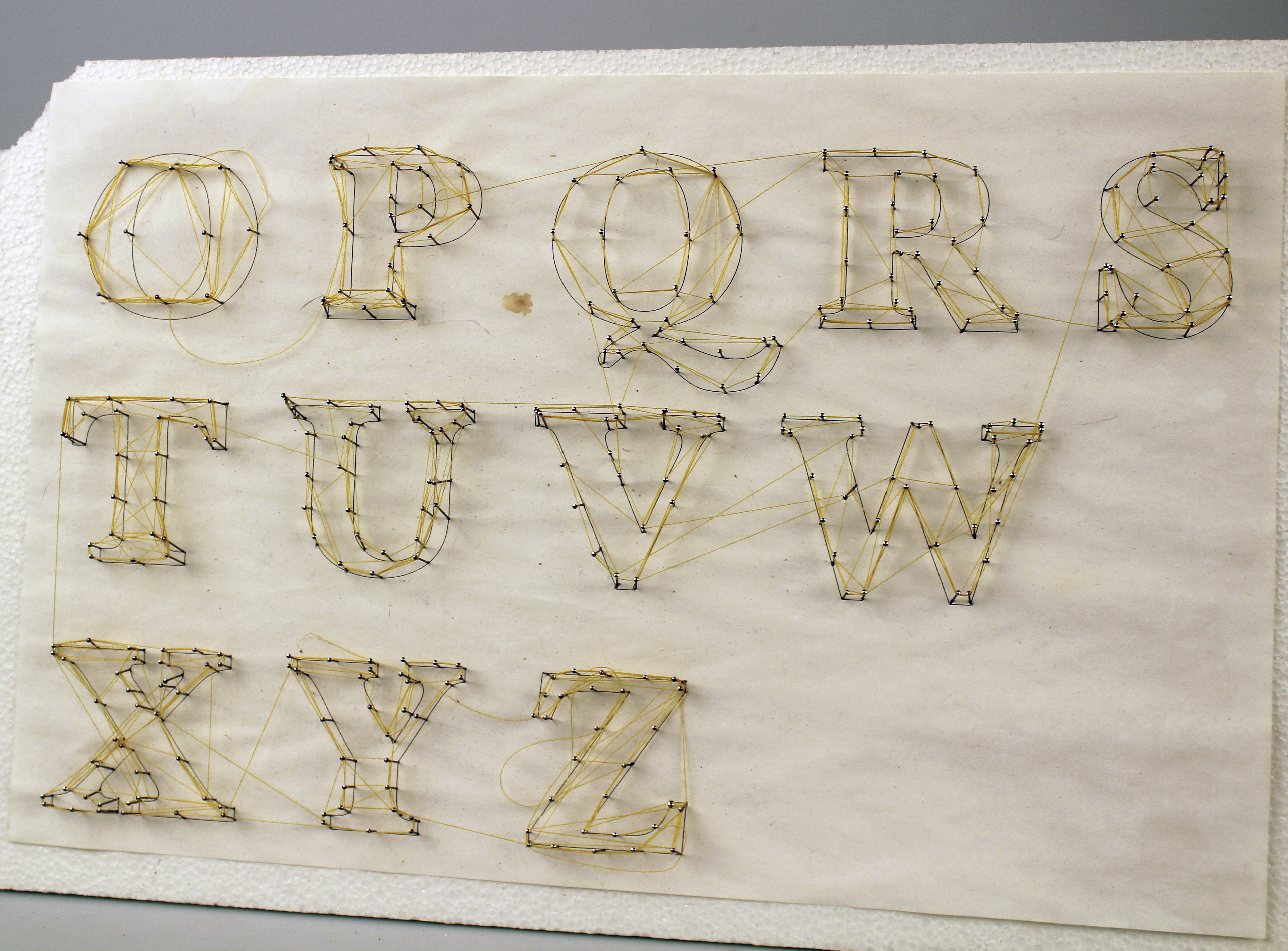
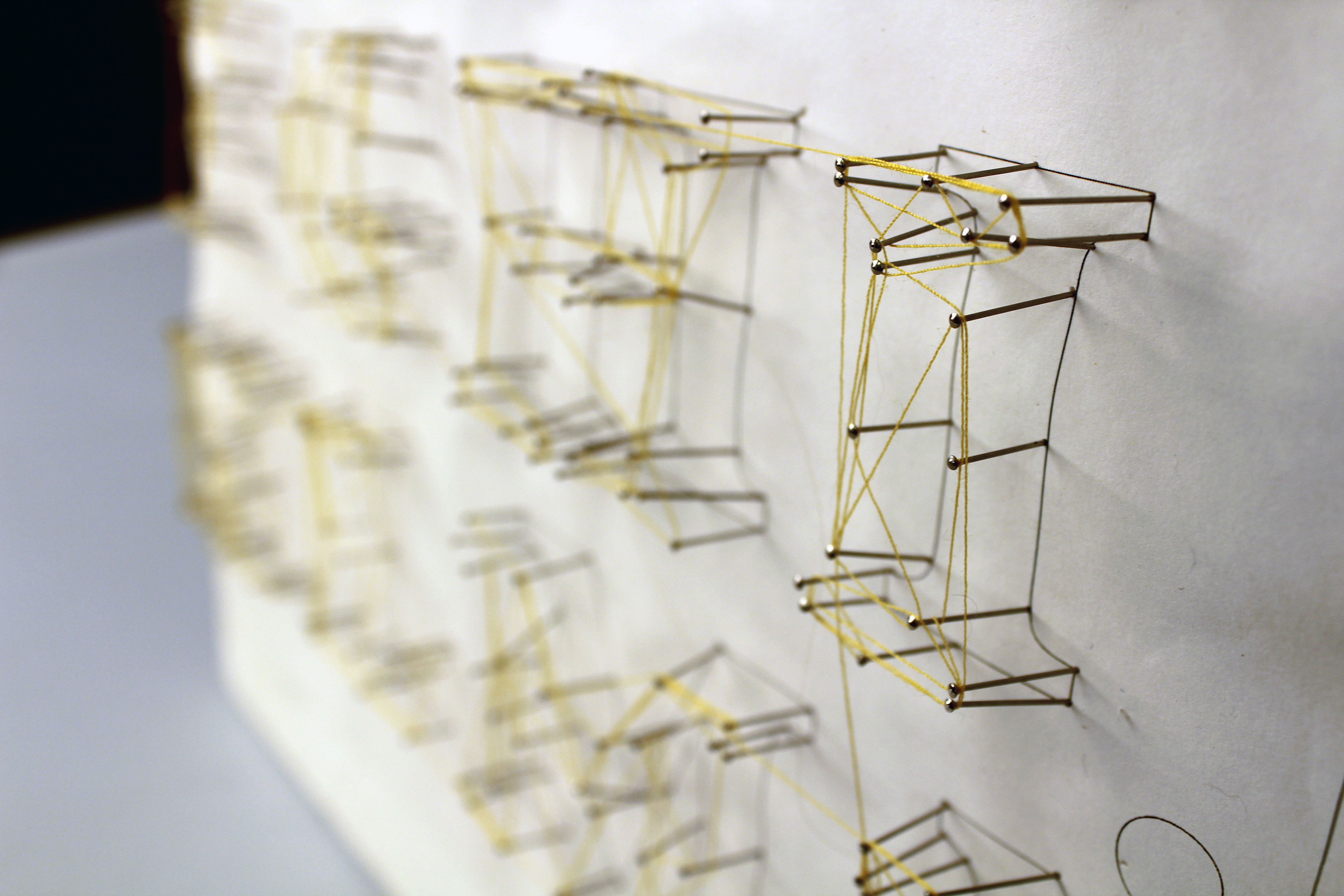
Here are some process images highlighting how I developed the typeface for the project. I was very drawn to how treacherous and fragile the city was depicted as, so I wanted to experiment with string as a medium and combine it as a typographical element.
In turn, this lead to me creating two custom fonts: one strung into weblike shapes and one completely made out of string to serve as the body copy.
In turn, this lead to me creating two custom fonts: one strung into weblike shapes and one completely made out of string to serve as the body copy.
